BEST ASPECT RATIO SHIFT
MOMMY
Aspect ratio has a long technical and creative history in cinema. It has evolved alongside technology while also being used as a dynamic tool, changing for action scenes, embracing distinct aesthetics, or to betray psychological shifts.
I went into this award with the belief I would be met with a veritable smorgasbord of movies to discover and watch during my research.
I was wrong (at least outside of the action scene shifting) and disappointed. I think aspect ratio shifts are such a powerful and rewarding technique.
Now, I suspect my sources were non-exhaustive, but that is somewhat the nature of the Itty Bitty Awards. Realistically, identifying something like ‘the best glance’ in cinematic history is impossible. There are simply too many movies to watch in a lifetime (and never enough). However, for aspect ratio shift, I was faced with the opposite problem; there was a peculiar lack of examples popping up. Every list I checked regurgitated the same 10 to 15 movies.
Perhaps this technique is more underutilised than I first imagined.
That said, if you were going to pick one quirk of filmmaking as a theme for a movie night, aspect ratio shift would absolutely give you a solid list of films to choose from.
ASPECT RATIO: A QUICK OVERVIEW
Aspect ratio is a funny little thing with a subtle yet important impact.
Technically, it’s just the width-to-height ratio of what you’re looking at. You’ll be familiar with 16:9 as the standard for things like monitors, TVs, and YouTube videos. It’s a similar ratio expression for film, with width typically being the larger of the two dimensions, as this is analogous to human vision. Our field of view is wider than it is tall.
The aspect ratio of movies and TV has also been tied to technology, screen size, and prevailing formats. With the rise of TikTok and other social media platforms, it wouldn’t be surprising if we started seeing some movies shot in 9:16, an interesting conflict with the established trend towards wider formats for cinematic spectacle.
If you’re familiar with film aspect ratios, you might be wondering why they look a little different or more complex than 16:9, even though they’re the same thing. In film, the convention for the aspect ratio is to express height as 1. This means the aspect ratio often includes a decimal point and appears as 1:1 for a square, 1.85:1 for widescreen, and 2.39:1 for anamorphic widescreen (scope), a ratio often associated with the ‘you have to watch it in the cinema’ blockbuster experience.
Aspect ratio is why we have black bars on our TVs when we watch movies but not TV shows, and part of the reason TV series look less ‘cinematic’.
OUTLIERS AND NOTABLE MENTIONS
Sometimes you just gotta go big. IMAX allows filmmakers to give extra height to their movies, either for the entire run time or to shift in and out for action scenes or visual impact. Examples of this you’ve probably heard every film bro talking about are Nolan’s The Dark Knight (2008) and Oppenheimer (2023).
To delve slightly into my own film bro weaknesses, you also see titans of cinema like Stanley Kubrick using aspect ratios to fit their vision rather than fitting their vision to the screen. This is famously seen in 2001: A Space Odyssey (1968), filmed in Super Panavision 70 with an aspect ratio of 2.20:1. The larger than life aspect ratio (among many other things) left 2001 as an industry defining experience when seen in cinerama (three projectors on a curved screen) but only a fragment of Kubrick’s true vision on a 1970’s square TV set.
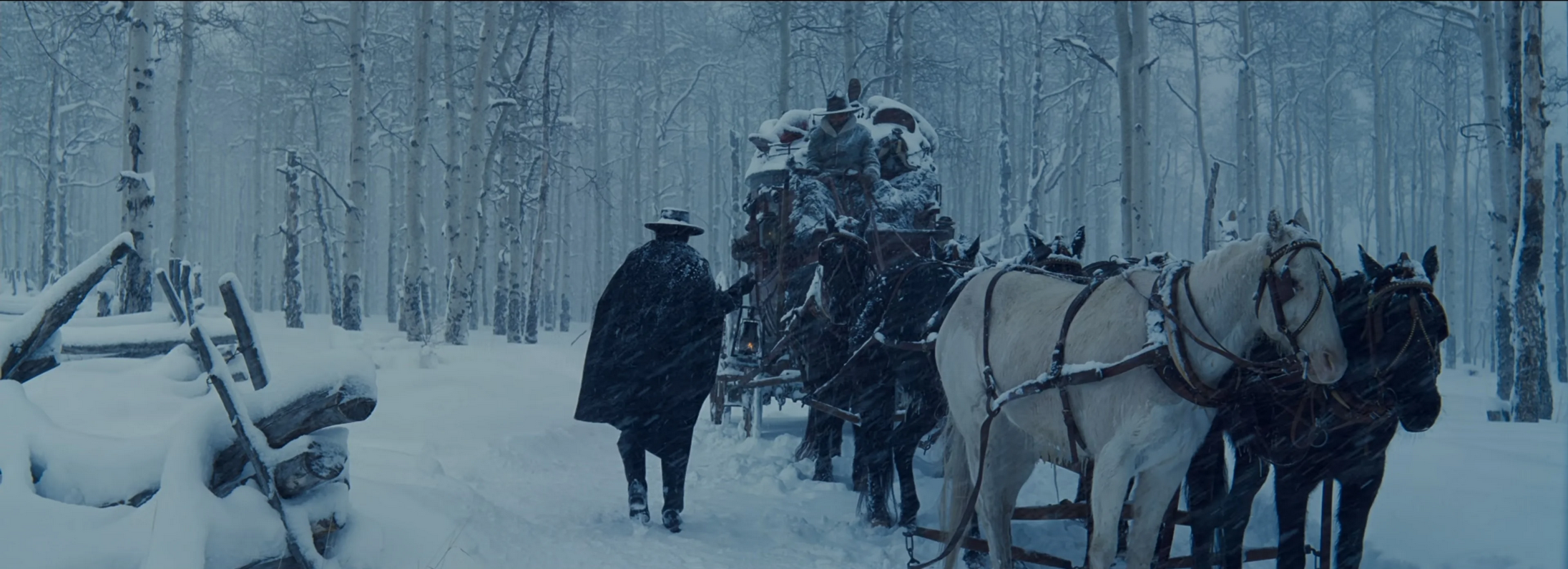
Screenshot from The Hateful Eight (2015), dir. Quentin Tarantino.
More recently, Tarantino’s The Hateful Eight (2015) was notably also shot using Super Panavision 70’s anamorphic spherical lenses, creating an awe inspiring aspect ratio of 2.76:1. I was lucky enough to see The Hateful Eight on 70mm in Odeon Leicester Square, and it made me feel how I imagine people in the 1950s felt when a new big picture was released. It felt like cinema in the old-school, Hollywood Golden Age sense of the word.
CORE CONTENDERS
For me, there were three core contenders for best aspect ratio shift: Wes Anderson’s Grand Budapest Hotel (2014), Xavier Dolan’s Mommy (2014), and It Comes At Night (2017), a quiet thriller from Trey Edward Shults, who continued gently exploring aspect ratio shifts in Waves (2019).
I realise, after namedropping Kubrick, Tarantino, and Nolan in the ‘notable mentions’ section, Mommy and It Comes At Night are giving David to Goliath. But that’s what the Itty Bitty Awards are about: the little things.
THE GRAND BUDAPEST HOTEL
I almost ruled Grand Budapest Hotel out for the same reason as Oppenheimer, et al.; it is primarily technical. But I think that was unfair, whereas there’s a technical language at play for Nolan, a dialogue with the audience and a tool at his fingertips. It is visual, it is impact, and it is for the viewer. Grand Budapest is somewhat like this, in that it uses aspect ratio as a filmic tool, but it is also depth. We experience the film in the manner the characters would, as the film’s ratio adjusts with the era on screen.
This is cute. This is charming. It’s slightly more than a tool; it’s immersive, it’s a full send.
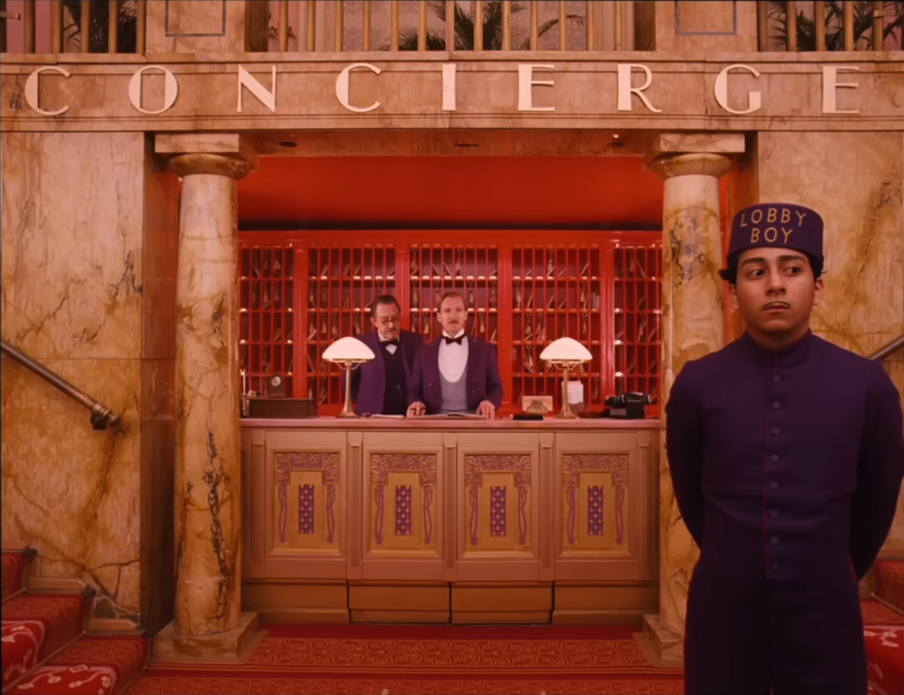
The Grand Budapest Hotel (2014), dir. Wes Anderson.
IT COMES AT NIGHT
The use of aspect ratio shift in It Comes At Night is simultaneously simple and yet also tied to the deep ambiguity of the narrative.
In It Comes At Night, the aspect ratio changes to reflect a specific character’s emotional state.
It left me wondering if the aspect ratio shift was the only definitive proof of the truth. In my opinion, the ambiguity of It Comes At Night is both its greatest strength and greatest weakness, and my thoughts on the aspect ratio shift are equally as conflicting.
If it is the only key to the truth, then it is a phenomenal application of the technique, but it also betrays the movie as too ambiguous, as there is no definitive clarification the audience can derive from something like aspect ratio shift. The narrative itself has a slightly unsatisfying conclusion, which I usually love, but here it felt mildly lazy or, perhaps, not pushed to its limit.
Conversely, if the aspect ratio shift isn’t the only true key to solving the film, then the application is simple, effective, but less noteworthy. It happens often, it is a slight shift, it is, at most, a gentle enhancement.
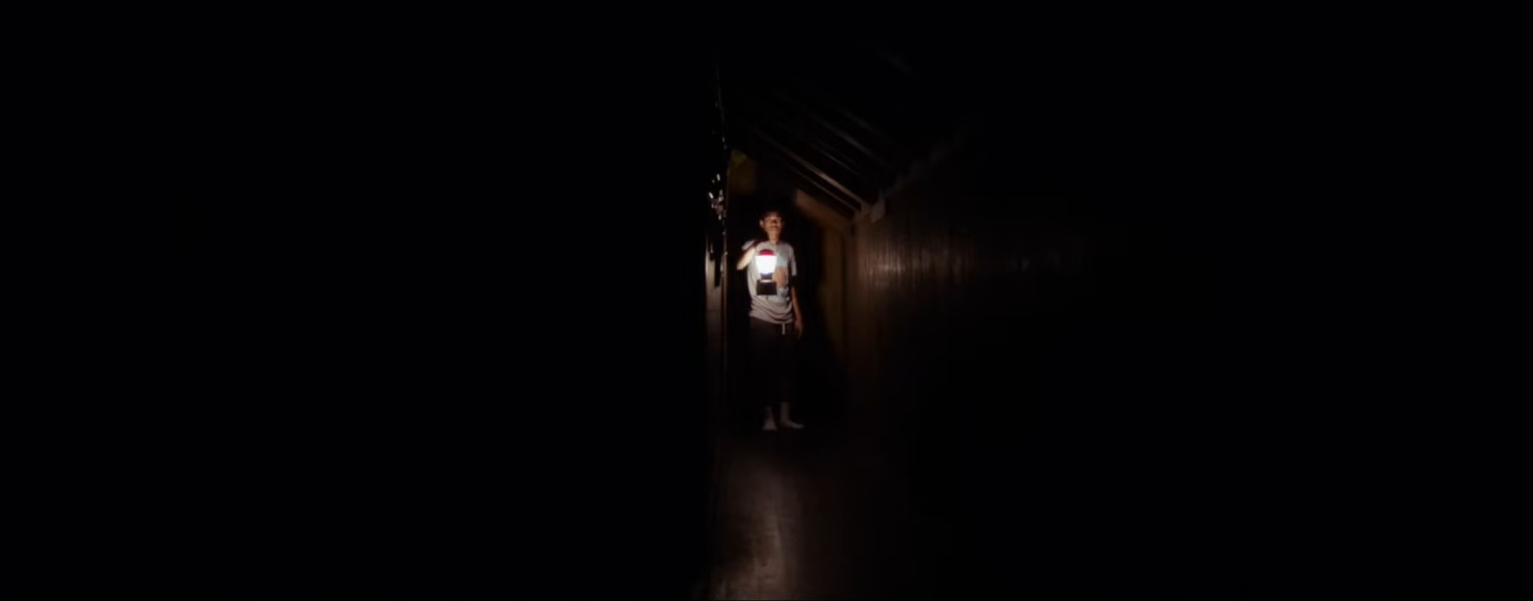
It Comes At Night (2017), dir. Trey Edward Shults.
MOMMY
Oh momma mia, Mommy absolutely cooks in the aspect ratio shift department. Phenomenal. No notes.
I don’t want to move too much into the space of reviewing the entire movie in these award blogs, unless the Itty Bitty Award is pertaining to an overall component of the film (e.g. best psychological shift). I think it’s nice to talk about the itty bitty, and the contenders’ itty bitties. However, when I think the movie is great, I’m going to take a moment to tell you.
So, here it is: Mommy is pretty damn great.
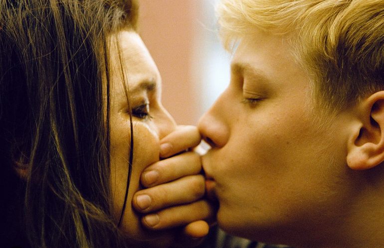
Mommy is a Canadian melodrama about a single mother, Die (Anne Dorval) and her 15-year-old son, Steve (Antoine Olivier Pilon), who has behaviour issues. There’s a peculiar undercurrent with a strange neighbour, a tense, engaging, and uncomfortable emotional pitch, and a distinct charm to this flawed human story.
At the end of Mommy comes its single aspect ratio shift. Now famous for how effective it was, on release, the shift was an impactful surprise to audiences. It gave me a feeling akin to a great narrative twist. But instead of revelation, it was a moment of elation.
The aspect ratio shift in Mommy is very distinct.
Spoilers regarding the emotional resolution of Mommy below.
Unlike It Comes At Night, where the black bars shift often and in the dark, Mommy’s singular shift is massive, from 1:1 to 1.85:1, into the bright, open, celebratory light. It’s a visual and emotional shift, a freedom, an exhale for the audience and the characters alike. In a movie that feels so mentally claustrophobic and oppressive, with the characters trapped in a hopeless cycle of life, the impact of the aspect ratio shift was equivalent to pristine closing dialogue. It spoke more than a script ever could: concise, clear, euphoric.
Interestingly, the shift is also a gentle engagement with the fourth wall. As Sam reaches out and opens his arms wide to embrace life, he also pulls the audience from a square box into a full, vibrant scene.
After watching 1000s of movies, there’s something to be said about one that can give you a new experience or feeling. Mommy’s was unforgettable.
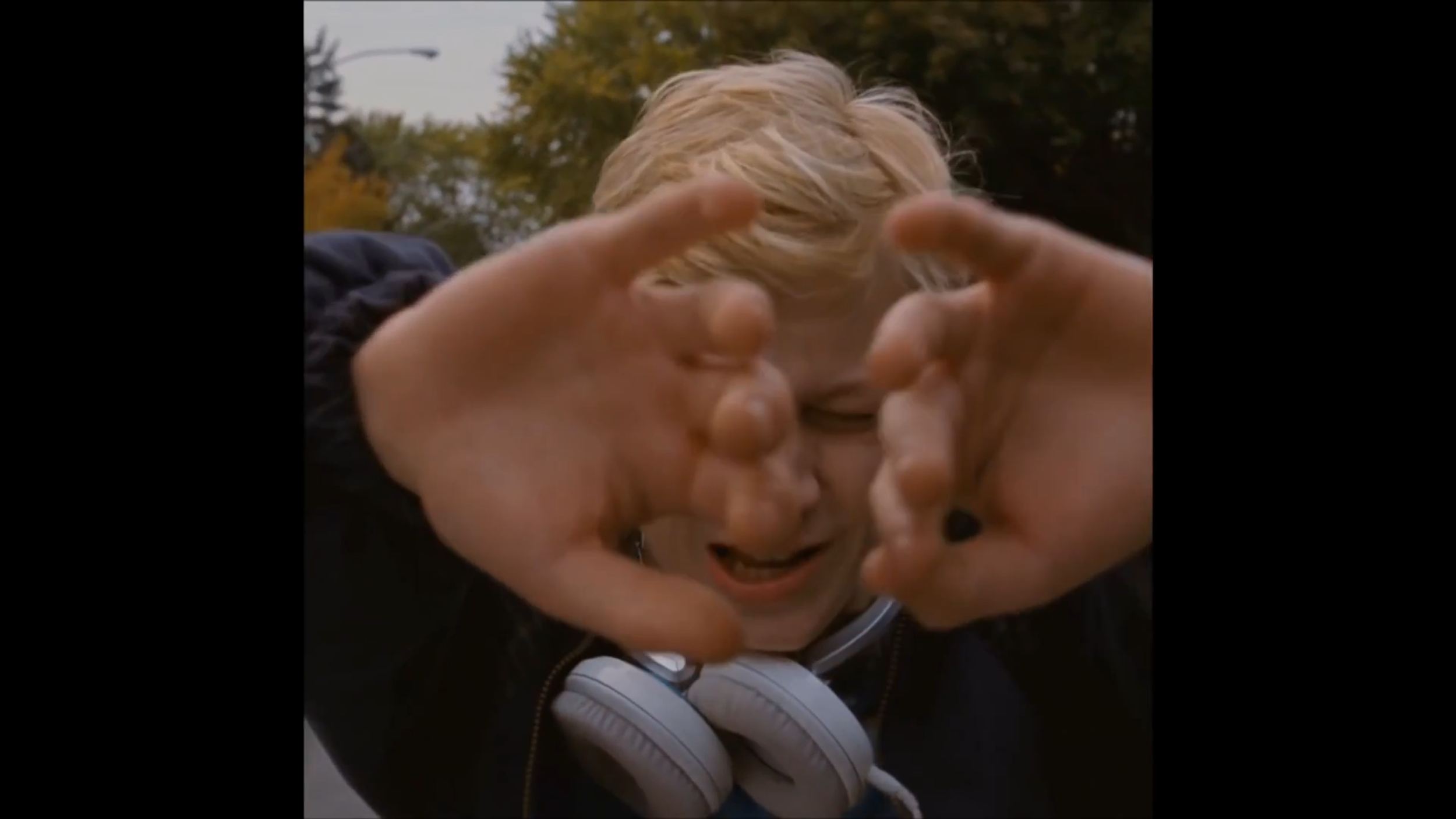
Mommy (2014), dir. Xavier Dolan.
THE WINNER OF BEST ASPECT SHIFT
The Grand Budap- just kidding. It’s Mommy. It was always going to be Mommy. We both knew it.